Over the years I’ve never really considered myself an illustrator – or at least not the typical pen-in-hand-type to draw for the fun of it. Adobe Illustrator only recently gave me new meaning of the word “illustrator” when I realized I don’t necessarily need to be pen-to-paper to “draw”. I’ve been doing this tracing/pen-tooling thing for as long as I’ve had access to the Adobe Suite.
Recently during a regular status call with a favorite client of mine – we were asked about our in-house ability to illustrate. Being the only creative team-member this question fell to me. I adore pets, animals, all things cute and furry. Any way that I could work with this client more would be a win but, I’ve never considered myself capable of illustrating. I said maybe. I was completely transparent and said “I don’t consider myself an illustrator by any means, but I know my way around well enough to be dangerous. Let me give it a try and see what we can come up with.”
New York Specific Vet Ads
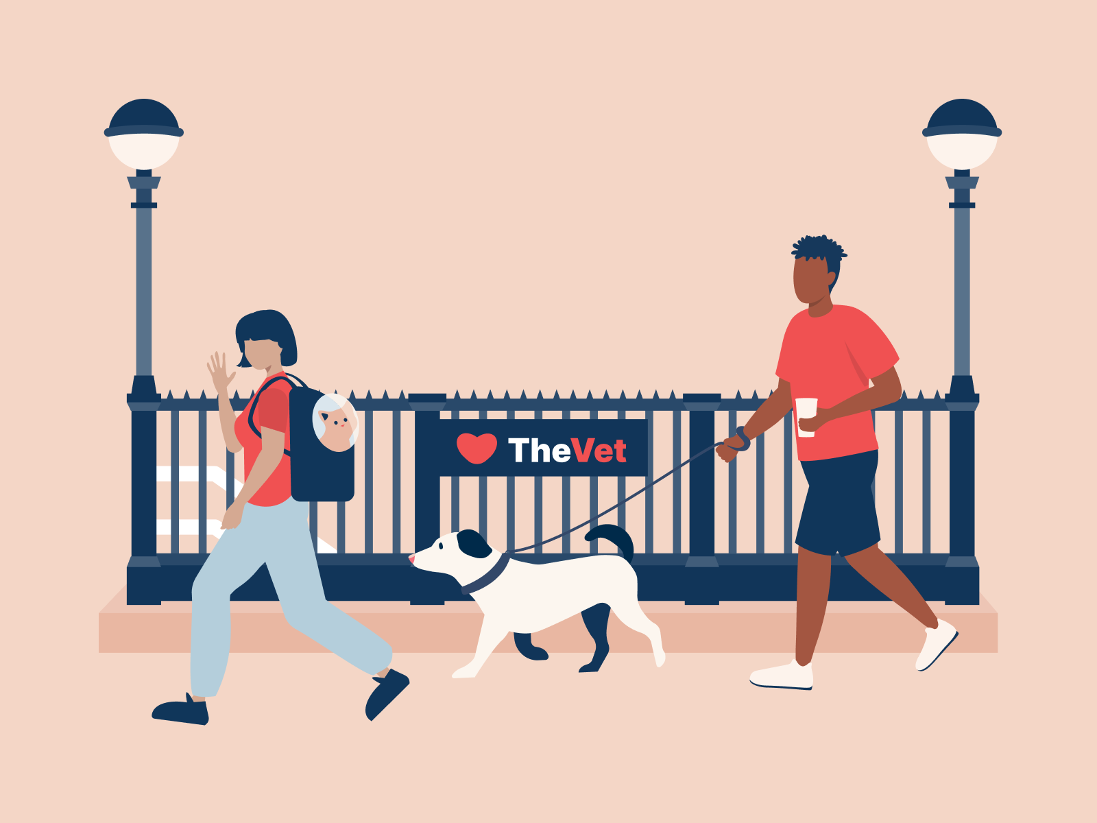
I was briefed with the Creative Director’s ideas for an ad set that focused on New Yorkers, their pets and of course – why NYC loves this particular vet. For inspiration she included a number of New York magazine covers, stylized illustrations of maps, illustrations of dogs reading newspapers, previous location-specific illustrations they had done in-house, as well as some other verbal ideas for this project.
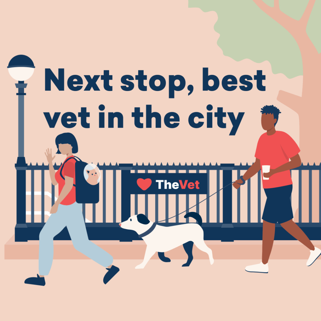
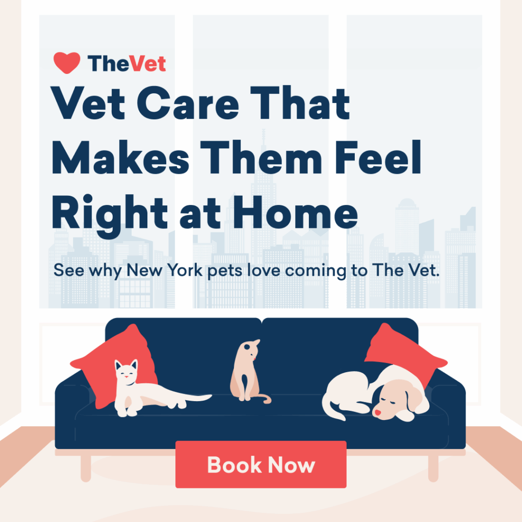
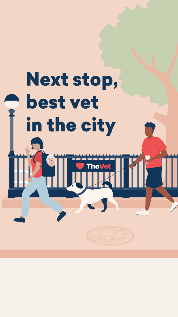
There are a few things that I know I’m particularly good at and enjoy replicating when it comes to using Adobe Illustrator and that is interior rooms, perspective-type imagery and just things that are more “straight” and not curvy. With this in mind I knew I wanted to try to create a hallway or room in a New York apartment, replicate the subway stairs and then my third direction was a little up in the air. I would just start and see where things took me.
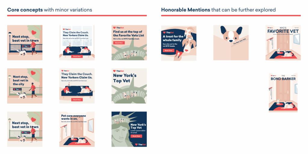
I ended up with a number of concepts and variations. I wanted of course to impress their team, but also wanted to make sure they saw all the different directions we could run with. I didn’t want anything to go to waste so I presented it all.
Illustration Concepts That Made the Cut
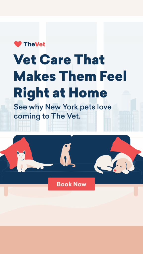
Overall the team seemed to be extremely pleased with everything I shared. The subway concept and couch concept were the most well received, which I anticipated. Not being a resident of New York, it was a bit lost on me that the Statue of Liberty wouldn’t be the most relevant choice, but the team still appreciated the concept and thought it could be used in a different setting instead. And as for the honorable mentions those were well received as well – especially the magazine cover replication, but in an effort to move things along quickly we all decided it was best to make minor tweaks and adjustments to the couch and subway concepts so that we could get these in market and just see if location specific illustrations actually perform well.
I worked out some final requested adjustments and these ads were ready for launch on Meta.
Both of these ad sets have performed well and have prompt the internal team to create more city-specific creatives. Can you take a guess as to which one above did better? Hint: Turns out the subway’s really pup-ular.