The Project
During a pitch, Juniper’s Culinary Lab* (JCL) tasked agencies with presenting a landing page strategy to improve performance. As the Front-End Developer/Graphic Designer, I led the project alongside our Creative Director who I collaborated with on content, creating a mockup of an optimized landing page for A/B testing against their current version.
Key Issues Identified:
- Weak Visuals: No recipe or food images above the fold.
- High User Drop-Off: Too many steps in the sign-up process led users to abandon the form.
- Overloaded Content: Text-heavy pages with no way of engaging felt impersonal, and overwhelming.
- Poor Value Perception: Though you can receive content like this elsewhere the page should explain the value of paying.
- Cumbersome Trial: A credit card requirement and difficult cancellation process deterred users.
My Approach:
I supplied two landing page options to present to the client that focused on streamlining the user journey, incorporating compelling visuals, and clearly showcasing JCL’s unique value propositions. By reducing friction points and creating a more engaging layout, I aimed to increase conversions and improve the user experience.
*Business name has been changed.
The Process
We identified the strengths of the existing JCL landing page currently in use, as well as areas worth testing for improvement.
Strengths:
- The headline effectively communicates the value proposition immediately.
- The page is uncluttered and focuses on a single conversion goal: getting visitors to join.
Areas to Test:
- Increase Visual Emphasis on the Offer: While the page highlights a 37% subscription savings, it is not immediately obvious to users.
- Introduce Snackable Sections: Testing a page with more bite-sized content can help users better engage with the information. For example, offering a free recipe can give potential members a preview of the value they’ll receive—using a top-rated, crowd-pleasing recipe can make the offer more compelling.
- Simplify the Sign-Up Process: Including at least half of the form directly on the landing page, instead of directing users to a separate form after entering their email, could reduce frustration and decrease drop-off rates. While capturing emails is beneficial for JCL, the current process can feel cumbersome and discourages users from completing the sign-up.
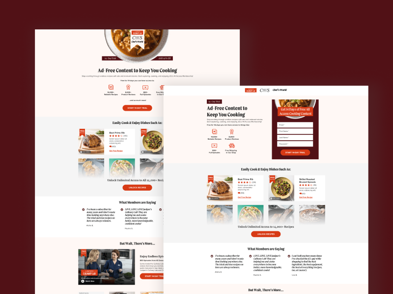
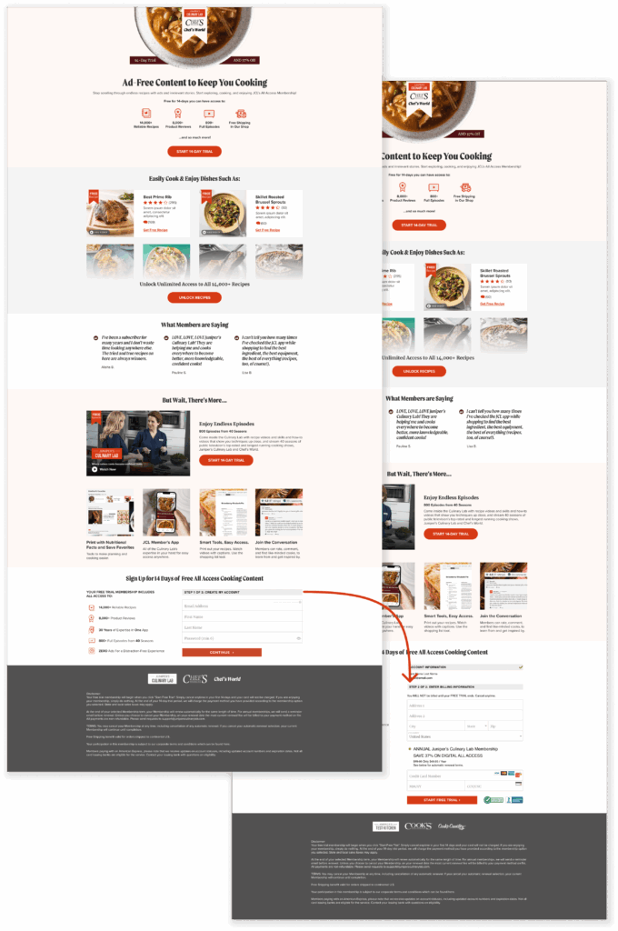
Below you can see the original LP:
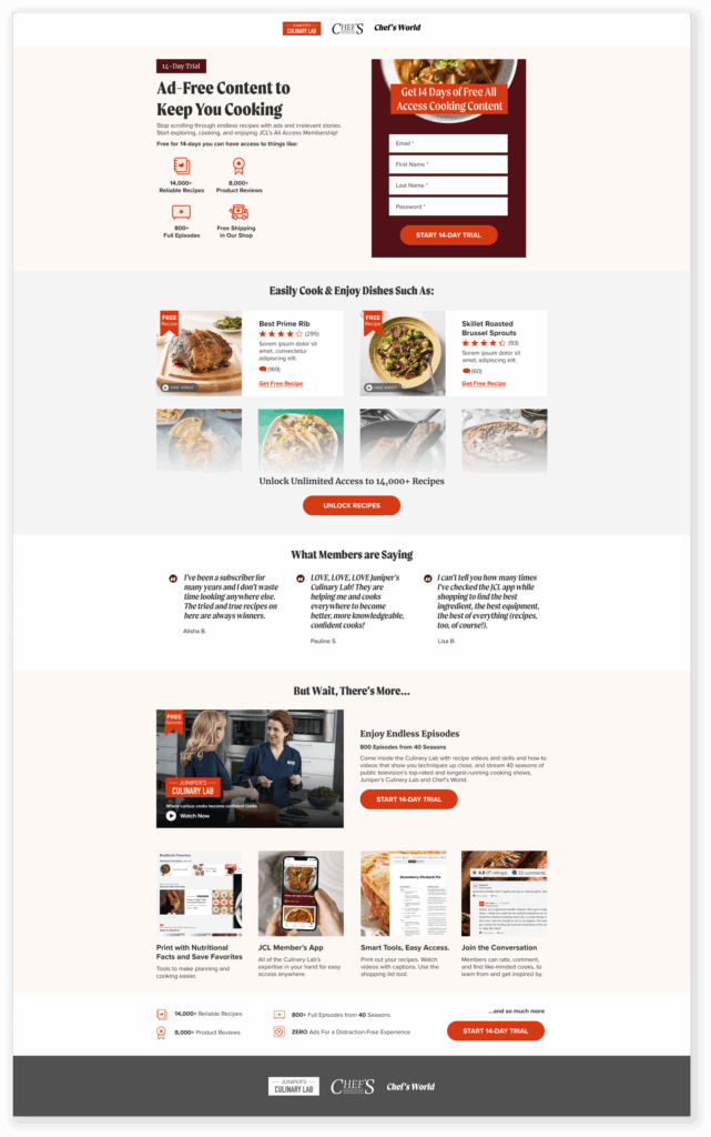
The Final Product
Landing Page Variation One
This variation focused on immediately highlighting the offer (14-day trial) and explicitly informing users what they will receive. Content below the fold encourages users to interact with the page. Clicking on the two free recipes displays them in a pop-up window, and the video plays directly on the page. This approach keeps users engaged on the page while providing free snippets of content to help them understand the value of the 14-day trial.
The form at the bottom of the page is split into two steps because JCL emphasized that all fields in the form are important to them. Including text that states “Step 1 of 2” sets the expectation for users that the form will require more information than what is initially visible.
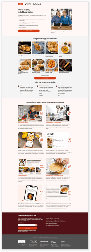
Landing Page Variation Two
The second variation has a similar approach when it comes to content, but instead I am recommending that JCL considers A/B testing with a short form. The shorter the form, the more likely users are to fill it out. This approach also allows for the form to be above the fold, which is another good test to perform.
The pitch for this client included a number of lines of business in addition to creative. I was only asked to supply one landing page design, but wanted go the extra mile in hopes of securing a new account. A number of “good jobs” were given for this landing page, both internally and externally despite the client deciding to move forward with another option.