
Creative Brief: Photographer Logo & Ad Campaign
Mike Cohea reached out with a rush request to create digital ads for his online shop, featuring 500-piece puzzles showcasing his stunning photography of Providence, Rhode Island. The ads were to appear on The Boston Globe’s website and in their newsletter. Alongside the ad campaign, Mike was also ready to take on a branding project—something he had been avoiding for a while, but was finally ready to tackle. We had a tight two-week turnaround, so a clear timeline was set to ensure we stayed on track while allowing time for collaboration and edits.
How the Brand Identity Came Together
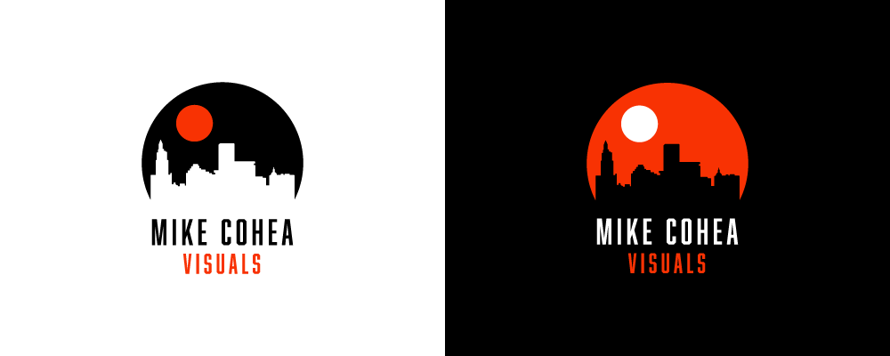
Before diving into the ad designs, I focused on creating three logo concepts for Mike’s brand. Known for his dramatic sunrise and sunset photography—often using a telephoto lens to magnify the sun or moon—I wanted to visually capture that iconic style. Mike described his brand as “adventurous and modern,” which helped guide the creative direction.
The color palette was built around orange, black, and white. Orange evokes energy, warmth, and adventure—an ideal nod to the glowing hues of a setting sun. Balanced with black and white, the palette created a clean, contemporary feel with a bold accent that draws attention.

The three concepts I presented each had their own design style while staying aligned with Mike’s reference imagery. Feedback was minimal, and the final logo was approved within 48 hours.


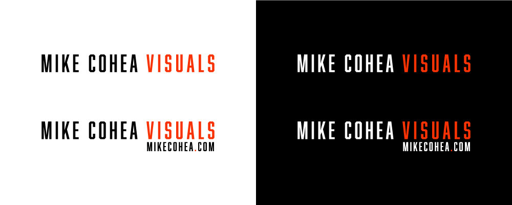
From there, I moved into the ad designs, building them with the same visual language—carrying over the typefaces, shapes, color palette, and graphic elements from the logo. Mike provided product photos, which I retouched and isolated for a cleaner presentation within the layouts. The consistent visual system helped bring the brand to life and provided a solid foundation for future assets. These designs were approved on the first round.
Final Logo & Digital Ads for Mike Cohea / Visual’s Brand
The final deliverables included:
- A finalized logo set capturing Mike’s photographic style and brand personality
- A set of digital ads designed for placement on The Boston Globe’s website and newsletter
- A cohesive visual identity using bold color, clean typography, and graphic elements inspired by Mike’s work


This project came together in under a week and a half, thanks to clear communication and quick feedback. Additionally, Mike was extremely pleased with the final deliverables and we continue to work together on his annual calendar.
“I’m so impressed by your skills! You made this process so easy and fun, I will be forever grateful. Thank you, Shannon!”
Mike Cohea,
Mike Cohea Visuals | mikecohea.com