Paul’s Fine Wine & Spirits, based in Cumberland, RI, needed branding for their store and employee apparel. As Creative Director at JAS Design & Screen-printing Studio, I led the project—concepting and iterating with them until we reached their desired brand.
During our initial discovery meeting, they shared ideas and asked to incorporate barley, hops, and grapes. They were looking for something more upscale than a typical liquor store and emphasized that wine was their primary focus.
With this information, I began with sketches, moved into Illustrator, and we worked through 2.5 rounds of designs. After finalizing the logo and brand, we collaborated on apparel designs in partnership with JAS’s owner, who leads all apparel production.
During Round 1, I presented three logo options: two based on their ideas and one focused on grapes, since wine was their primary focus. They chose Option 1, where the “P” in Paul’s connected to the grapes, appreciating how the logo felt like one cohesive piece.
Option 1 – A modern and sophisticated approach that focuses on one specific aspect of their products. This option was chosen with adjustments requested.Option 2 – A “cornucopia” of elements that depict all the products their store has to offer.Option 3 – Specific faucets of the store are displayed in what could be recognized as a box that contains a bottle of wine or other alcoholic drink.
In Round 2, I designed a hybrid “fruit” combining barley, hops, and grapes, and provided three variations. They selected two of the logos—one for their primary logo (option 3) and one for secondary use (option 2).
Option 1 – Incorporated the hops and barley into the grapes in a non-layout changing way.Option 2 – Used the barley to create an asymmetrical balance. This option was chosen as the secondary logo with adjustments requested.Option 3 – This concept had more of a “classic” feel with a crest-like “fruit”. I think this version really elevated the graphic and made it feel more formal. The client mentioned they wanted the logo to feel more “whole”. This option was provided to resolve the feeling of graphic/text just sitting next to each other and not intertwined. This option was chosen as the primary logo with adjustments requested.
A few minor refinements were requested for the primary logo, and I provided additional options. From there, the final version was selected, and we moved into apparel design, as shown in the Proof 3 presentation.
Option 1 – The client felt the space next to “Paul’s” in the last proof felt empty – I added an accent line to create more balance in this version.Option 2 – In this version I removed the stem and ‘P’ connection all together and made it so the entire store name lived together. This option was selected as the final logo.Option 3 – Again, I removed the stem and ‘P’ connection, but made the store offerings all the same font. This version makes the logo more compact.
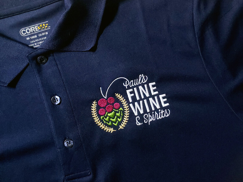
Upon delivery, the client received a complete brand guide, including all necessary assets and variations of their logo, along with their final embroidered apparel for employees to wear, ensuring a consistent and professional look across the brand.
Final Color Palette – The colors chosen were inspired by natural colors of grapes, hops and barley and a neutral/dark primary color that produces enough contrast for visibility.Final Wordmark – The word mark’s intended use is for signage outside the store and/or on the road. The color of “Paul’s” and “spirits” can be any of the colors in the palette.Final Icon – The icon is planned to be embroidered on wine bags, beanies and hats or used in other places where the entire logo is not necessary.Secondary Logo – The secondary logo was used on employee and owner apparel.Primary Logo – The primary logo is used in all other cases, primarily on the store’s website and other places online.