The Vision
I was contacted by Mike Cohea for a rush request to design digital ads for his online shop. The ads were to go on The Boston Globe‘s website/newsletter and advertise 500pc puzzles that display Mike’s beautiful photography of Providence, Rhode Island. Mike also wanted to brand himself – something he had been avoiding, but decided to finally bite the bullet. With these deliverables needed in roughly two weeks we got to work quickly! A timeline was put in place for both of us to follow so that we were able to hit the date and still have enough time for edits between proofs. Because of both of us working so speedily – we were able to finalize everything in under a week and a half.
Before starting any ads, I created three logo concepts for Mike’s brand. Mike is a photographer in Rhode Island is well known for his amazing pictures of the sun/moon at sunset or sunrise. In his photography he uses a telephoto lens to display the moon or sun much larger than it actually is. Because this is something he is known for, I took that into consideration when creating the concepts. I also asked Mike to describe his brand – he defined it as “adventurous & modern”. These descriptors helped create a color palette – orange, black and white were the colors that made the most sense to use. Orange calls to mind feelings of excitement, enthusiasm, adventure and warmth. Orange is the color of bright sunsets, so many people might associate the color with the beauty of a setting sun. For these two reasons I knew orange was the color to use as an accent. Using the visual balance of black and white with an accent color leads to powerful messaging and is a helpful strategy when wanting to draw attention to a specific object or to create a visual that pops. People tend to associate black and white with words like clean, modern and luxurious.
The concepts were presented – all being similar but having their own design style. Mike had given a few examples of what he was looking for. Those examples gave me the perfect base to create something I knew would be what he was looking for. The concepts didn’t have many edits and the logo was approved in under 48hrs.
The finalized logo was the jumping off point for the ads – I used all the same elements, shapes and font to create them. Mike provide photos of his product and I photoshopped the background out so that the puzzles looked cleaner in the design. I think that once the ads were completed the brand really felt “real” and brought to life. The elements (circles, rounded shapes, city line art, font, colors, typography style, etc.) used could be used moving forward in other initiatives. I look forward to seeing how the ads did in The Boston Globe! Check out the products here if you want to see the amazing photos that you can puzzle together.
The Process
Branding Proof 1 – View Presentation
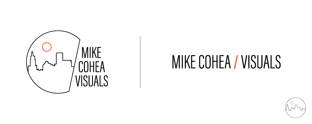
Option 1 – Modern line-work graphic of Providence, RI with a moon/sun overhead. The font chosen evokes minimalism and modern vibrations.
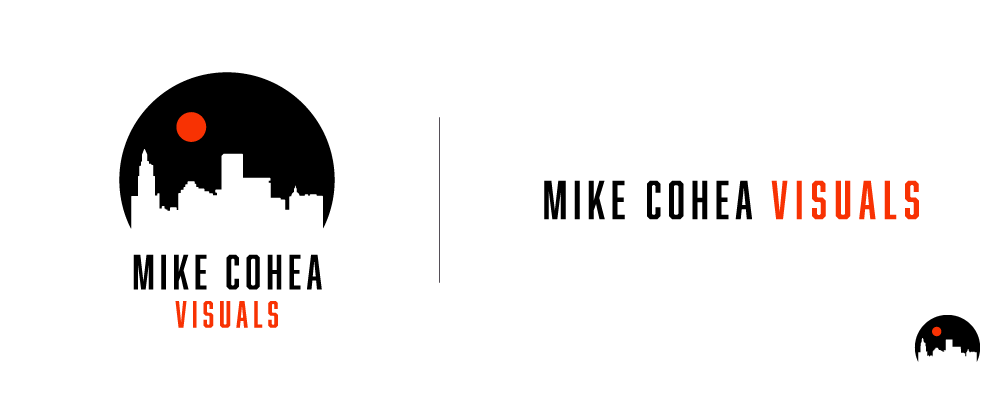
Option 2 – A more contrast heavy version of Providence, RI that uses negative space to show a graphic. The font chosen in this version is more masculine/sport-y which evokes adventure. This option was chosen with one minor adjustment.
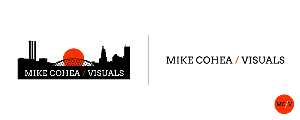
Option 3 – This logo concept focused more on the photography aspect of the Mike’s business. It was meant to feel more like a scene being photographed rather than a standalone graphic of the city of Providence.
Branding Proof 2 – View Presentation
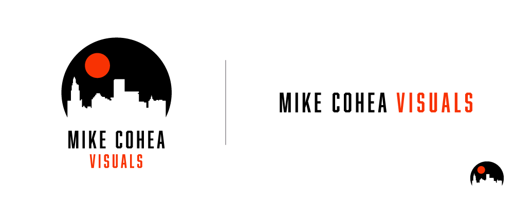
Option 1 – Can you spot the change that the Mike requested? The orb was made larger in this version to compliment the style of photography that Mike does. He uses a telephoto lens to make the moon/sun larger than the city below.
Final Product
Final – Branding Guideline Presentation

Final Color Palette – orange, black and white to represent adventure, modern and sunsets.
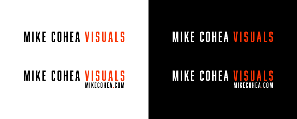
Final Wordmark
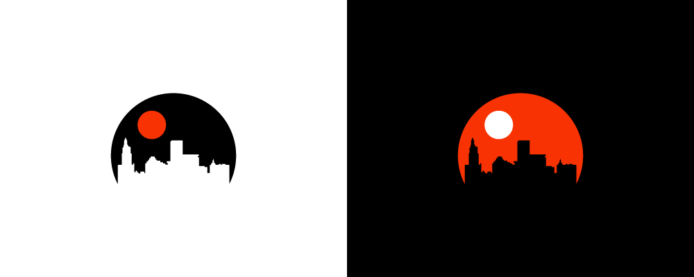
Final Icon
Secondary Logo – It was requested to include a version with their website URL, this type lock up was adjusted to account for that.
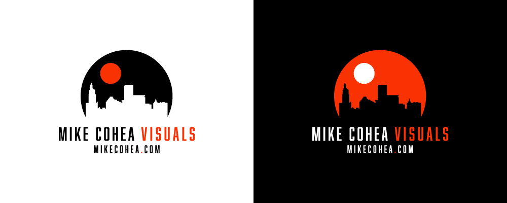
Primary Logo
Final Digital Ads
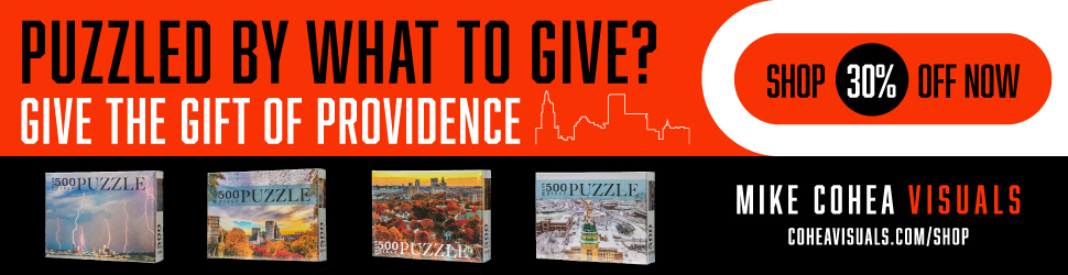
Ad 1 – This is the primary ad, it’s the largest one at 970×250 and the one we were able to fit the most content on.
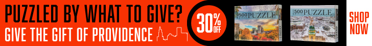
Ad 2 – This ad is 728×90 and is quite small. Much less content is used here and we needed to narrow down the amount of puzzles displayed.
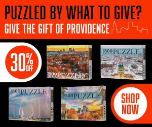
Ad 3 – This ad is 300×250. The configuration is different than the other two wide ads so, the puzzles needed to be stacked.