The Vision
Paul’s Fine Wine & Spirits, located in Cumberland, RI, was in need of branding for their store and branded apparel. As the Creative Director at JAS Design & Screen-printing Studio I took the lead on this project. In our initial meeting the client had the idea to incorporate barley, hops and grapes in some way. They provided a sketch to share what they were thinking. In the first round of ideas, I had two options based on their sketch and one option with only grapes since wine is their primary focus. During my presentation of the 3 initial logo concepts, the first and third option were contenders. Ultimately the way that the “P” in Paul’s connected to the grapes won them over. They explained that they liked that the logo felt like one unit vs. two separate units (text with a graphic). With that in mind and the incorporation of barley, hops and grapes still being important, I designed a hybrid “fruit” that encompassed everything they wanted and gave three different configurations for that hybrid. Again, they liked two options in round 2. They decided they would use one for their primary logo and one for their secondary logo. A few small tweaks later and a final logo was decided on! Once the logo was finalized, I provided mockups for apparel. The secondary logo was chosen to be on the left pocket area. I color matched thread to the final color palette so that their employee uniforms would be as consistent as possible to their web logo. Overall the client received great feedback from others on the design, they were pleased themselves and really loved how this one turned out – I did too!
The Process
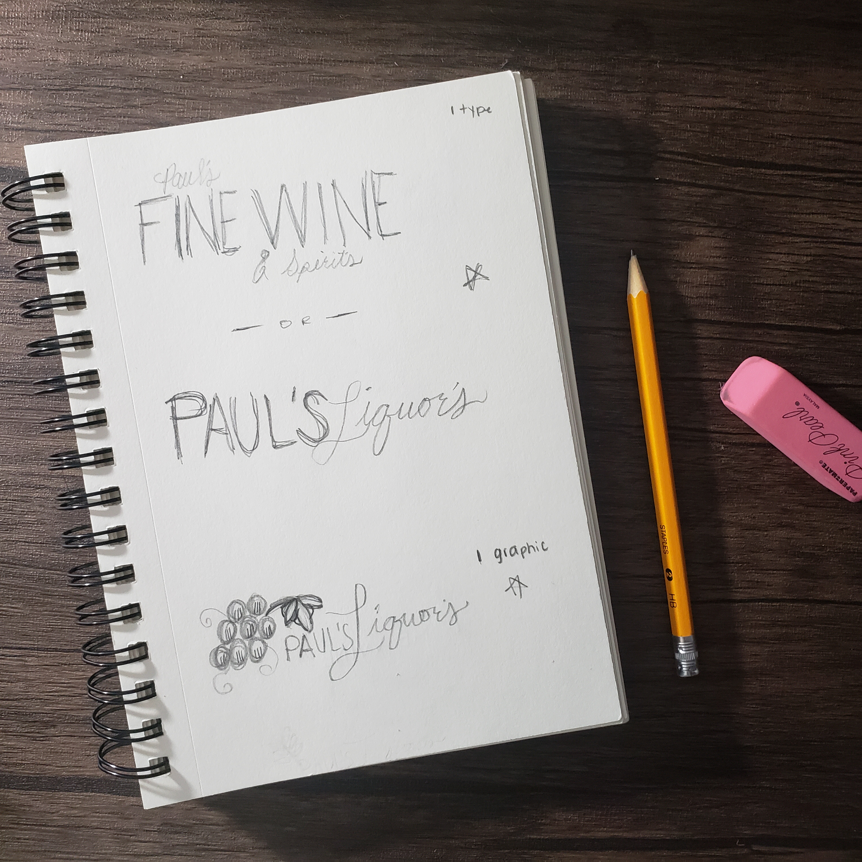
Sketches after consulting with the client to figure out what their ideas were.
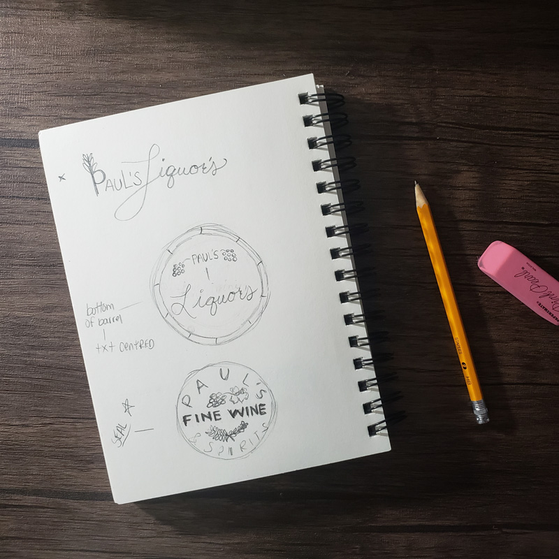
Additional sketches – the starred concepts were brought into the computer
Proof 1 – View Presentation
Option 1 – A modern and sophisticated approach that focuses on one specific aspect of their products. This option was chosen with adjustments requested.
Option 2 – A “cornucopia” of elements that depict all the products their store has to offer.
Option 3 – Specific faucets of the store are displayed in what could be recognized as a box that contains a bottle of wine or other alcoholic drink.
Proof 2 – View Presentation
Option 1 – Incorporated the hops and barley into the grapes in a non-layout changing way.
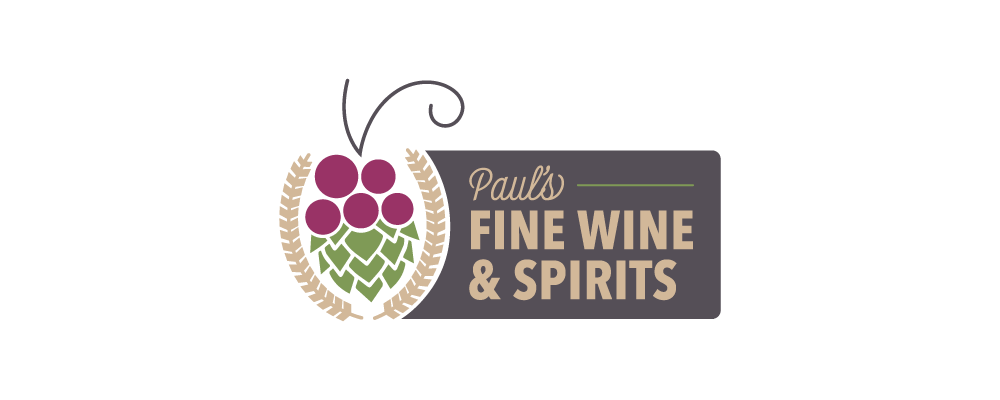
Option 2 – Used the barley to create an asymmetrical balance. This option was chosen as the secondary logo with adjustments requested.
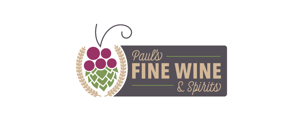
Option 3 – This concept had more of a “classic” feel with a crest-like “fruit”. I think this version really elevated the graphic and made it feel more formal. The client mentioned they wanted the logo to feel more “whole”. This option was provided to resolve the feeling of graphic/text just sitting next to each other and not intertwined. This option was chosen as the primary logo with adjustments requested.
Proof 3 – View Presentation
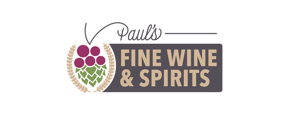
Option 1 – The client felt the space next to “Paul’s” in the last proof felt empty – I added an accent line to create more balance in this version.
Option 2 – In this version I removed the stem and ‘P’ connection all together and made it so the entire store name lived together. This option was selected as the final logo.
Option 3 – Again, I removed the stem and ‘P’ connection, but made the store offerings all the same font. This version makes the logo more compact.
Final Product
Final – Branding Guideline Presentation

Final Color Palette – The colors chosen were inspired by natural colors of grapes, hops and barley and a neutral/dark primary color that produces enough contrast for visibility.
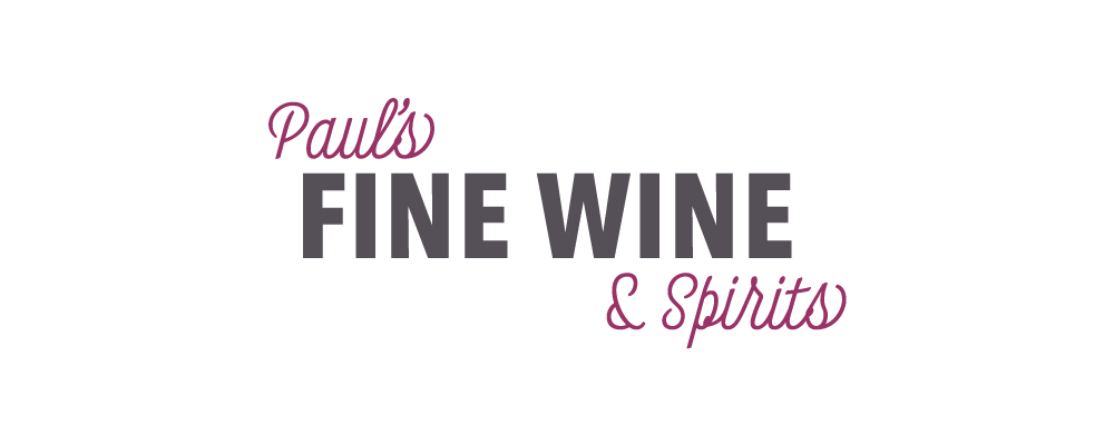
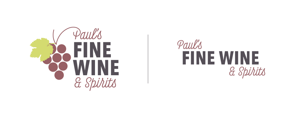
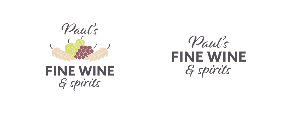
Final Wordmark – The word mark’s intended use is for signage outside the store and/or on the road. The color of “Paul’s” and “spirits” can be any of the colors in the palette.

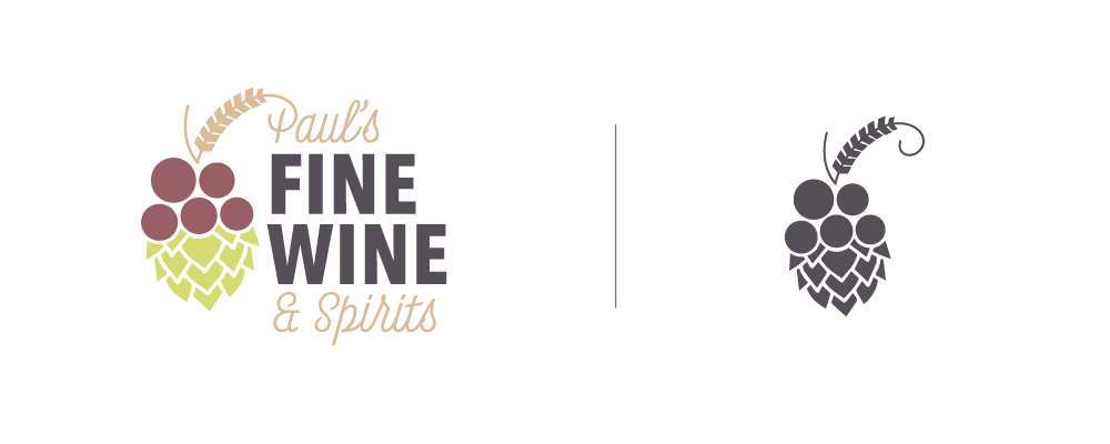
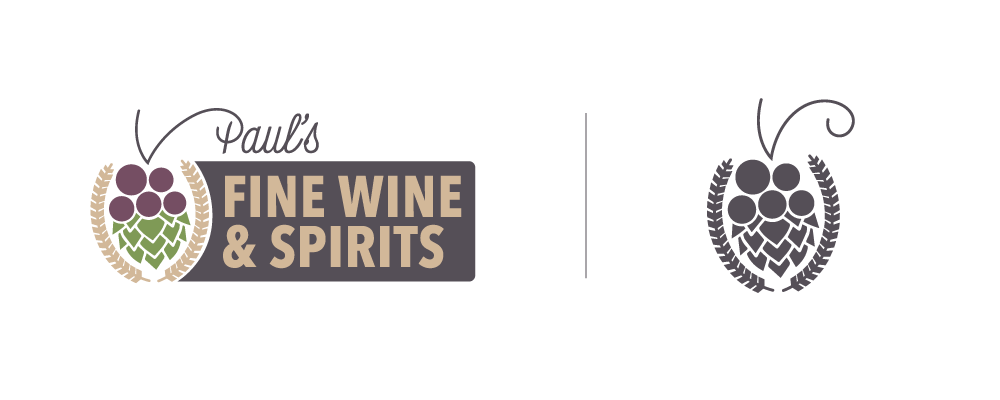
Final Icon – The icon is planned to be embroidered on wine bags, beanies and hats or used in other places where the entire logo is not necessary.

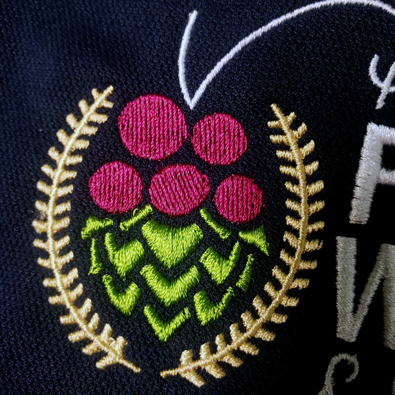
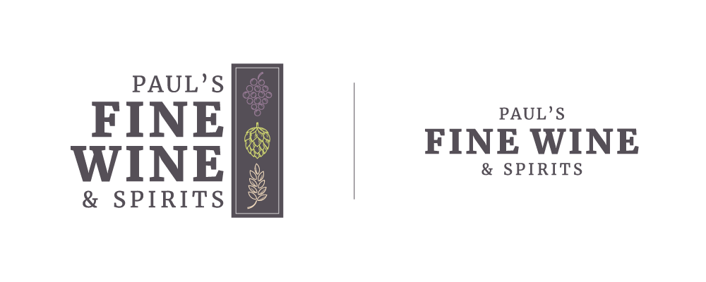
Secondary Logo – The secondary logo was used on employee and owner apparel.
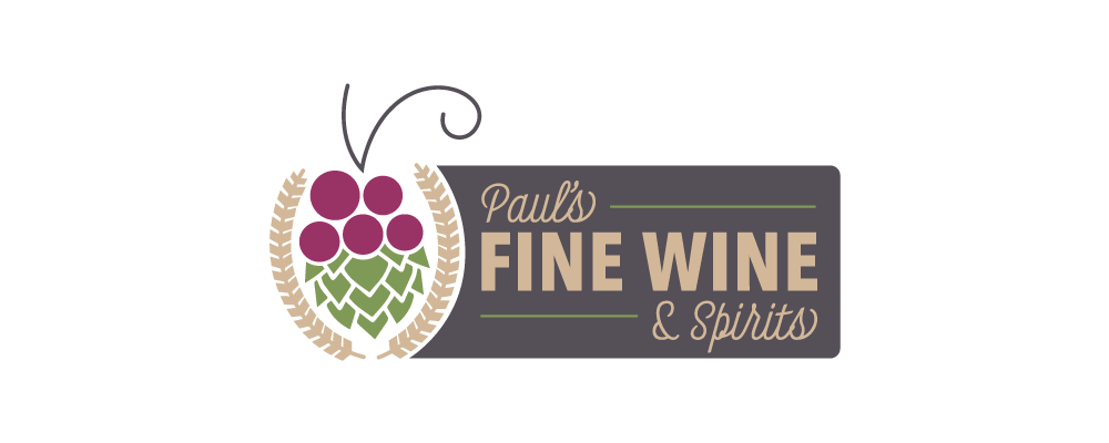
Primary Logo – The primary logo is used in all other cases, primarily on the store’s website and other places online.
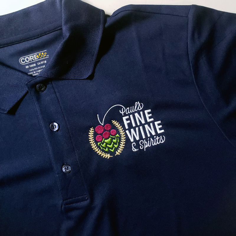
Embroidered employee apparel